5 Google Data Studio “hacks” that will change your life (or at least your reports)
Coming up in this blog are the following five handy "hacks" to help with your reporting in Data Studio. I'll show you how to:
- Remove query parameters using a custom field
- Calculate conversion rate for a specific action
- Use advanced date ranges
- Apply filter functionality
- Use charts to create a dimension ‘scorecard’
#1 - Removal of query parameters using a custom field
Query parameters are an analyst’s nightmare, leaving you unable to determine users’ true behaviour onsite. Anything that comes after a question mark causes pages to become fragmented, misreporting the true value of the pages.
If you’re unable to remove these parameters directly in Analytics (for example, any parameter values that are of use), or if you want to report fragmented page performance historically, you can do this within Data Studio really easily.
Simply create a custom field in your data source:

Then give your field a name and enter this formula:
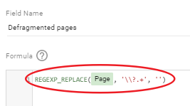
This replaces anything found after the question mark with nothing – removing any query parameters in your page report and aggregating every previously fragmented page.
#2 - Calculate conversion rate for a specific action
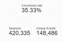
Custom fields have always been a feature of Data Studio, however until relatively recently this didn’t allow you to segment down to a specific attribute of the metric you were using to calculate. For instance, you were able to calculate a custom conversion rate by doing unique events divided by sessions, but you weren’t able to specify a particular event.
Introducing blended data! Now you are able to perform calculations using segmented data.
First pick your two metrics to blend your data, ensuring that the unique event has a filter applied for the specific action. In this instance we want to calculate conversion to add to basket:
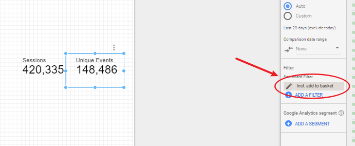
Select both metrics, and blend:
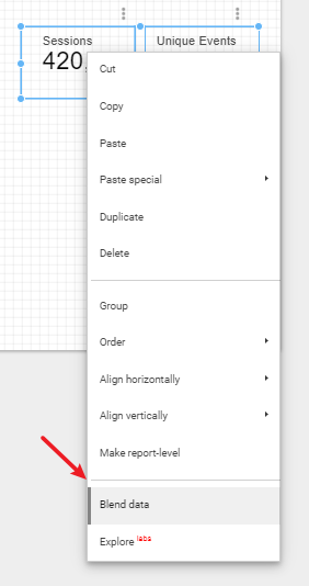
Now, click on the metric in the settings panel, as if you were going to change which metric was used, and click ‘Create Field’:
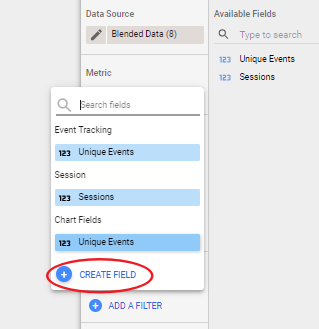
Finally, give your field a name, and enter in your conversion rate formula (making sure you change the type to percent):
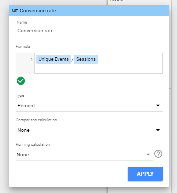
Creating your conversion rate field:
#3 - Advanced date ranges
Quite often you’ll want to report on a more flexible date range, and while Data Studio provides a good few options in terms of ranges for you to choose from, it does (or rather did) fall down in allowing for rolling date ranges.
With the introduction of advanced date ranges, setting a rolling date range is now incredibly simple.
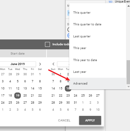
To access the advanced date range settings, go to the date settings and scroll all the way down to ‘Advanced’:
Once there you’re given the option to choose a start and end date. As an example, we’ll use a rolling twelve months.
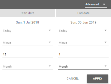
First change the start date to Today minus 12 months, giving you the 1st July. Next change the end date to Today minus 1 month which outputs the 30th June:
You have several options to customise this. You can add start date as fixed if for example you want to report on performance since a campaign went live. Or you can report to the previous day, setting the end date to Today minus 1 day. This is a really flexible feature and one of my favourite additions Google has added since launching the tool.
#4 - Apply filter functionality
One of the great things about Data Studio is it’s interactive-ness, and there’s a subtle, recent addition to the features in the platform that enhances this.
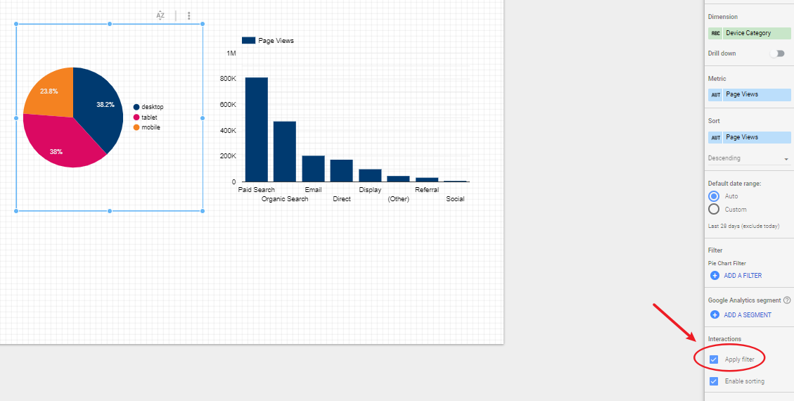
The ‘Apply filter’ feature is a small checkbox that appears at the bottom of the Data settings when you create a chart. Checking this box allows the viewer of the report to click on the chart and apply that dimension as a filter to other charts on the page.
To add this feature to your report, create your charts, and make sure that this little checkbox is checked:
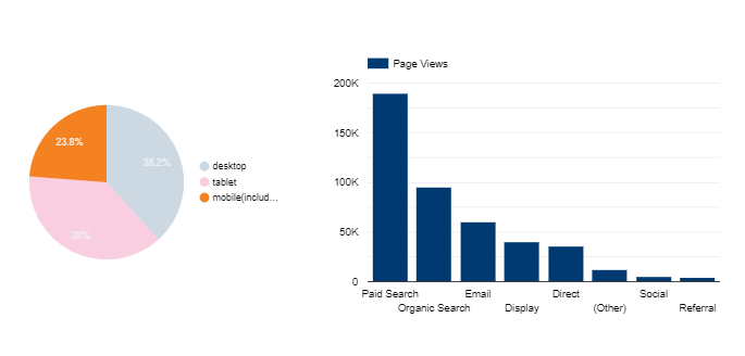
When in view mode you can then click on the mobile segment of the pie chart, and this will be applied as a filter to the bar chart:
#5 - Use of charts to create a dimension ‘scorecard’
There are occasions where you might want to showcase the highest performing element of your website, for example the device with the highest conversion rate, or the page that sees the most traffic.
Tables allow you to order dimensions according to these types of values, however there is a lot of other periphery to conceal (headers etc.) and you might want to solely keep the attribute name, without the metric against it.
You can do this using charts in Data Studio.
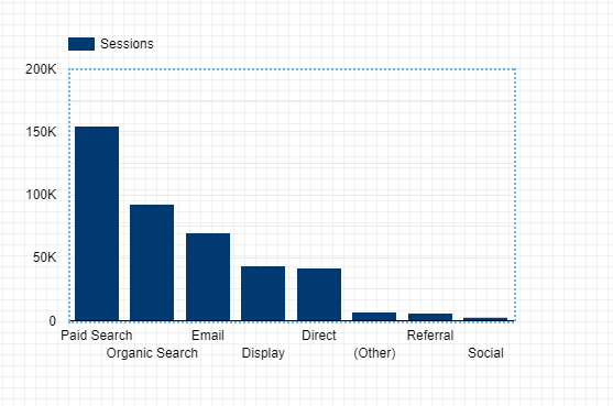
Say we want to highlight the channel that drives the most traffic to the website. Create a bar chart as you would usually, with your dimension of channel and a metric of sessions, and make sure the chart is sorted by sessions:
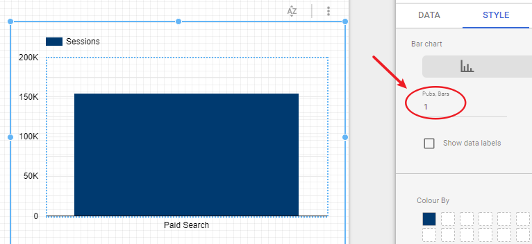
Next you want to change the number of bars on the chart, this option is located in the Style section of the settings, and should be altered to one:
Change the legend to ‘none’:
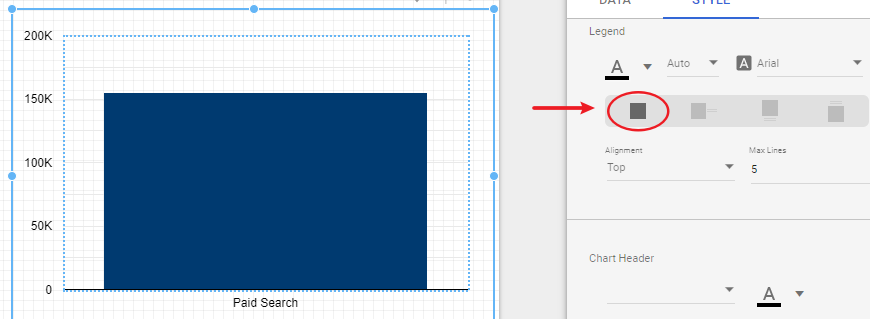
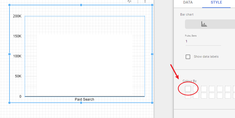
Change the colour of the chart to the same colour as your background:
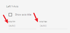
To remove the final axis line, you need to change the Axis min and max values to 0, then change them both back to auto:
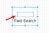
Now you can resize the grid using the dotted lines until the axis values have gone and the block is small enough to just see the value:
There you have it – our 5 Data Studio “hacks” that will change your reports. If you’d like to learn more about our Data team and how they could help your business, please get in touch.
Our insights
Explore the latest perspectives from our team.